One of the easiest improvements that you can do to a photograph in post-processing is adjusting the levels. This decides which part of the photo is black, and which is white. It's very easy to do and will add more contrast to your work.
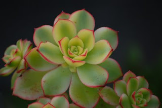
This will be the image that we start with. As you can see, there is a lot of gray in the background where it should be black.
I use Adobe Photoshop to do all of my editing, but there are many free programs that can do this.
GIMP is supposedly a good program, and its free.
Start by opening your photo in your desired image editing software.
Open the levels adjustment Image->Adjustments->Levels. Or for a shortcut press Ctrl+L on your keyboard.
There should now be this on your screen.
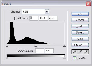
The 3 eyedroppers on the bottom right can be used by first clicking on the eyedropper, then clicking on the image.
The first eyedropper is used to show where the image should be black. (on my image this would be used on the background to make it black)
The second eyedropper is used to correct the white balance, use this on a spot in the image where is should be a gray, but is colored.
The third eyedropper is used to show where the image should be white.
Next is the histogram, this is the graph in the the middle of the levels window. This shows how much of the photo is black, white, gray, and all the shades in between. You can use the 3 sliding arrows on the bottom of the graph to adjust which part of the image should be pure black and white.
The middle arrow is used to adjust the mid-tones in the image.
After I moved the black arrow on the histogram to the right a little for my image, it made the darker tones black, which made the background black instead of gray.
Here is the original and the final image.
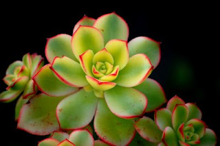
Here is another example, using the white eyedropper on the background.


You have to be the judge on when your photo is done editing. It's important not to go too far.
There are many more things that can be done with the levels adjustment, but it's important to practice and see how everything works.
Don't be afraid of making mistakes, there's always
undo.